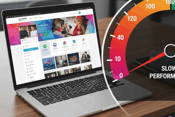
Why Mobile-Friendliness Matters in Today’s Digital Landscape
In today’s digital world, a mobile-friendly website is no longer optional—it is essential. With the majority of online traffic now coming from smartphones and tablets, businesses that fail to optimize their websites for mobile users risk losing out on valuable customers. Consumers expect fast, seamless, and visually appealing browsing experiences no matter what device they are using. If a website is difficult to navigate, slow to load, or poorly formatted on a phone screen, potential customers are likely to leave and look elsewhere.
The shift toward mobile browsing is not a passing trend but a fundamental change in how people engage with the internet. Whether someone is searching for a restaurant, browsing homes for sale, or researching a product, their first instinct is to reach for their phone. For businesses, this means the first impression often happens on a mobile device. Ensuring that your website is mobile-friendly directly influences how your brand is perceived and how effectively you can compete in a crowded online marketplace.
Enhancing User Experience Through Mobile Responsiveness
User experience lies at the heart of a mobile-friendly website. When visitors arrive on your site from a smartphone or tablet, they expect the same level of accessibility they would find on a desktop. A responsive design adapts to any screen size, presenting content in a way that is easy to read, navigate, and interact with. This includes properly scaled text, buttons that are easy to tap, and layouts that adjust without forcing users to zoom in or scroll excessively.
A positive mobile experience encourages visitors to stay longer, explore more pages, and engage with your business. On the other hand, a frustrating experience leads to high bounce rates, with potential customers abandoning the site before learning what you have to offer. By prioritizing mobile responsiveness, businesses create an environment where users feel comfortable and confident, which increases the likelihood of turning casual visitors into loyal customers.
The Connection Between Mobile Design and SEO
Search engines like Google prioritize mobile-friendly websites when determining rankings. In fact, Google’s mobile-first indexing means that the mobile version of your site is the primary basis for how it evaluates and ranks your content. This means that if your website is not optimized for mobile devices, it could fall behind in search results, regardless of how strong your desktop site may be.
SEO and mobile-friendliness go hand in hand. A responsive site ensures faster load times, streamlined navigation, and proper content formatting—all factors that search engines reward. Additionally, mobile users often search with local intent, such as “restaurants near me” or “real estate in Gulf Shores.” A mobile-optimized site positions your business to appear prominently in these search results, giving you an edge over competitors who have neglected this crucial aspect of web design.
Driving Conversions and Sales with Mobile Optimization
A mobile-friendly website does more than just attract visitors—it converts them into paying customers. When users can easily browse products, fill out forms, or contact your business from their phones, they are more likely to take action. Features like click-to-call buttons, simplified checkout processes, and mobile-friendly contact forms remove barriers that might otherwise discourage customers from completing their journey.
Businesses that invest in mobile design often see higher conversion rates because the path from interest to action is smoother. Consider the difference between a customer struggling with a clunky form on their phone versus one who can complete the same process with a few simple taps. In an era where convenience drives consumer decisions, mobile-friendliness is directly tied to revenue growth.
Real-World Impact of Mobile Usability
The consequences of neglecting mobile-friendliness are clear. A website that is slow, difficult to navigate, or poorly formatted on mobile devices frustrates users and damages brand credibility. Customers often equate a poor mobile experience with a lack of professionalism, assuming that a business that neglects its website may also neglect its products or services.
Conversely, businesses that embrace mobile optimization gain a competitive advantage. For example, a local restaurant with a mobile-friendly menu and reservation system is far more likely to attract customers than one with a site that requires endless zooming and scrolling. Similarly, a retail store with an easy-to-navigate mobile shop will capture sales that competitors lose when their sites cause customer frustration. The difference lies not in the quality of the product or service, but in how easy it is for customers to access it.
Steps Businesses Can Take to Become Mobile-Friendly
The process of making a website mobile-friendly begins with responsive design. This ensures that the layout, images, and text adjust automatically to fit different screen sizes. Testing across multiple devices and browsers helps identify potential issues that may not be obvious on a desktop. Streamlining content, optimizing images, and simplifying navigation are also crucial steps in creating a smooth mobile experience.
Mobile-friendliness also means considering the unique needs of mobile users. Features like one-click directions, location-based search optimization, and easy access to business contact information can significantly enhance usability. Regular updates and ongoing monitoring ensure that the site continues to perform well as technology and consumer expectations evolve.
Why Investing in Professional Web Design Pays Off
While some businesses attempt to patch together mobile solutions, investing in professional web design delivers far greater long-term benefits. Professionals understand not only the technical requirements of mobile responsiveness but also the strategic role it plays in branding, marketing, and customer engagement. A well-designed mobile website aligns with your business goals, creates a seamless customer journey, and strengthens your overall online presence.
The return on investment becomes evident in improved search rankings, increased traffic, higher conversion rates, and enhanced customer loyalty. In a marketplace where digital impressions often determine success, a mobile-friendly website is one of the smartest investments a business can make.
Conclusion: Mobile-Friendliness as a Business Essential
The digital landscape has shifted, and mobile-friendliness is now a cornerstone of business success. From improving user experience and boosting SEO to driving conversions and building trust, a mobile-optimized website has far-reaching impacts. Businesses that embrace mobile design are not only meeting current consumer expectations but also preparing themselves for the future.
At its core, mobile-friendliness is about accessibility, convenience, and credibility. It shows customers that you value their time, understand their needs, and are ready to provide solutions at their fingertips. In a world where the majority of online interactions happen on mobile devices, the question is no longer whether your business can afford to invest in a mobile-friendly website—it is whether you can afford not to.
